Three Corporate Logo Proposals — Carried Through to the Usage Guide
Three corporate logo proposals — decide the mark first, then build the site
For a company operating pilates studios, we proposed a corporate website together with a new logo. These are the three logo proposals. Our approach is to settle the logo first and then carry its colour and form into the site.
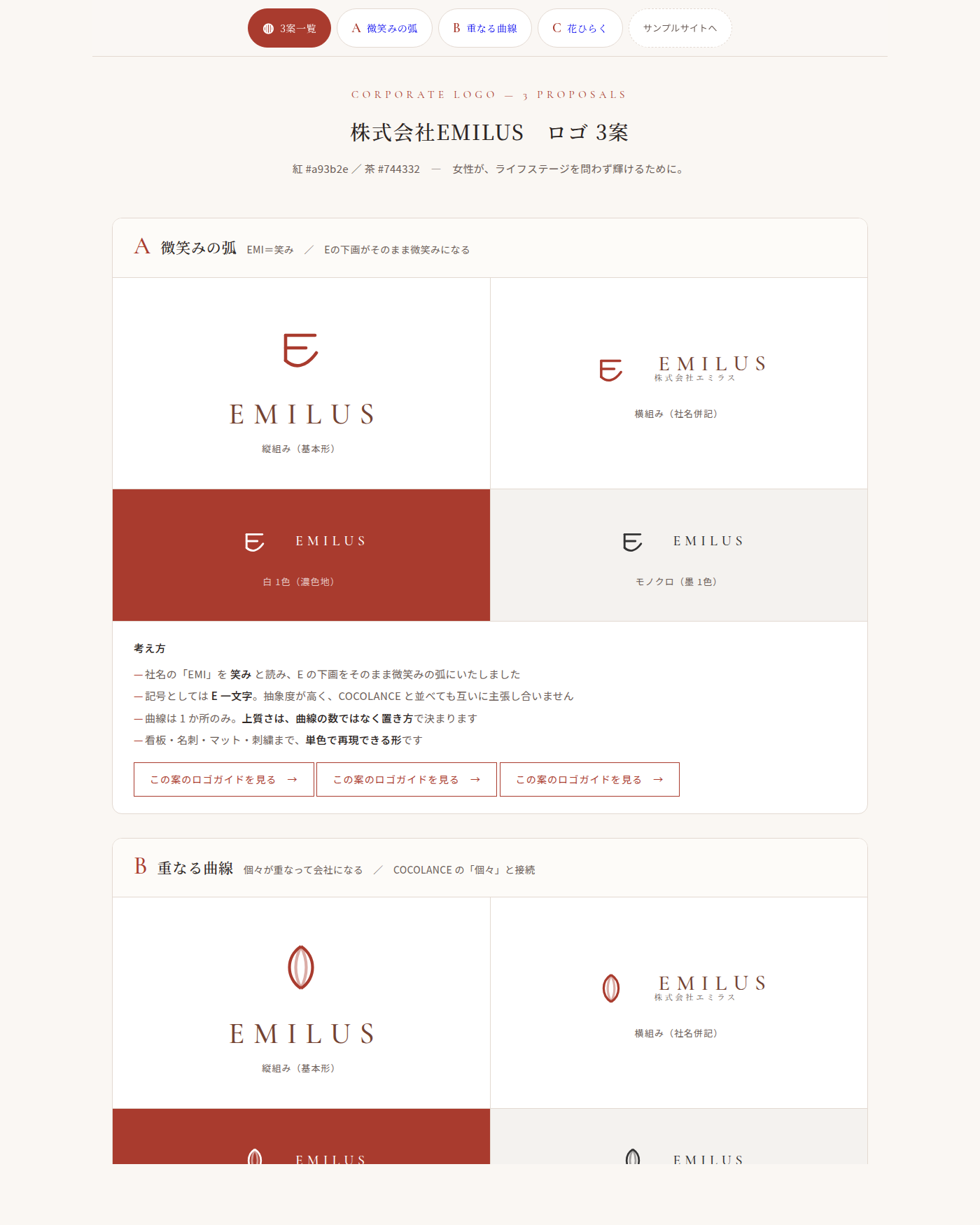
The three proposals
- A — The arc of a smile: reading the "EMI" in the company name as a smile, the lower stroke of the E becomes that arc. As a mark it is a single letter, abstract enough that it never competes with the existing brand beside it
- B — Overlapping curves: individuals overlapping to form a company, giving shape to the connection with the individuals the existing brand already speaks to
- C — A flower opening: the philosophy of shining at any stage of life, taken directly into form
What we watch for when presenting
1. It has to reproduce in a single colour
Signage, business cards, mats, embroidery — where a logo is actually used, it is used in one colour. We work on the principle that quality comes from placement rather than from the number of curves.
2. Vertical, horizontal, white on dark, and monochrome, all shown at once
Each proposal is laid out in four presentations. A logo chosen from the primary form alone becomes a problem later, at the places where it actually has to be used.
3. The usage guide is part of the same job
Three proposals, two rounds of adjustment, then the derived files and the logo usage guide — all within a single quotation. Minimum size, clear space, and the uses to avoid are gathered onto one sheet.
The colours were sampled from the images of the two reds the client sent us, and used as they actually are.